Overview
This project reimagines Coachella as a multi-sensory seasonal experience. It creates a speculative identity system that explores how color, sound, and type can shape emotional memory. Through three imagined editions titled Cherrychella, Greenchella, and Bluechella, it offers a playful but intentional redesign of the festival’s visual language. Each version is rooted in mood, cultural nuance, and personal connection. The goal was to stretch the boundaries of what a music festival can feel like and what it can represent for different kinds of listeners.

Concept & Direction
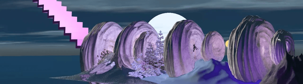
Inspired by the ever-changing emotional and visual rhythms of the seasons, this project reshapes Coachella’s brand identity by introducing three seasonal editions: Cherrychella, Greenchella, and Bluechella. Each theme is rooted in color psychology and genre blending, evoking a different atmosphere through artist lineups, typographic treatments, and promotional visuals. From surreal cloud textures to immersive gradients, the branding language plays with memory, temperature, and cultural layering.
Execution & Visual System
The full identity includes environmental banners, digital promotions, and merchandise like hoodies and scarves. Each colorway reflects a specific tone—pink for pop futurism, green for rave mysticism, and blue for nostalgic dreamscapes. Typography is used playfully to match each world’s energy, while the overall system maintains visual consistency across all materials. The goal was to imagine a Coachella that feels expansive yet personal, where fans find versions of themselves within each themed experience.