Overview
This series explores typography as more than just a tool for communication. Each piece treats type as a visual material, shaped by rhythm, space, and emotion. Through repetition, distortion, and movement, the work looks at how words can take on new meaning when form becomes part of the message. The focus is on feeling and structure, not just legibility.

Conceptual Focus
These pieces started as a way to question how language lives on a page. Some explore silence and space, while others feel more crowded and chaotic. The designs are influenced by concrete poetry and the physical experience of reading. Text stretches, loops, and builds to reflect internal states like tension, stillness, or sensory overload. The goal was to let the form of each word carry just as much weight as its meaning.
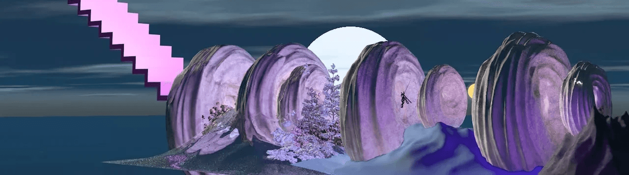
Featured Explorations
Highlights include a quiet study on the word “space,” where text dissolves into emptiness, and a chaotic swirl of overlapping words that reflects emotional noise. One piece builds from a single phrase repeated into a dense circular form, while another uses typographic layering to echo memory and fragmentation. Across the set, the work pushes type beyond traditional layout, turning language into an immersive visual experience.